
The iterative UX research and design process for optimizing the landing page
The team observed drop-off on multiple pages throughout the patient's journey. To identify the most critical area for improvement, we analyzed the webpage's analytics data. This revealed that the landing page had the highest drop-off rate, with approximately 10% of users leaving immediately upon arrival. Recognizing the landing page as the first point of contact, we decided to prioritize this page over the others.
To gain a deeper understanding of user perceptions and identify opportunities for improvement, I built and launched a survey targeting a representative sample of individuals who matched the diversity of our patient population. Due to privacy and security concerns, I did not reach out directly to users. Instead, we recruited study participants who reflected the various demographics and usage patterns of our actual user base.
The survey revealed key areas where users felt the webpage could be enhanced, such as simplifying the content and improving the visual appeal. These insights provided a direction for our design efforts, ensuring that our improvements were aligned with user expectations.

Next I examined other check-in services for visual inspiration, both in the healthcare industry as well as outside of it. From this research, I began to see patterns and identify how we might be able to innovate on the traditional approach to an online check-in service. I shared the commonalities with the broader team to help get alignment and drive the visual direction of the webpage.

I worked with the product manager to ensure we accounted for all of the various edge cases and client configurations of the webpage. By understanding these different scenarios, I ensured that the design could scale seamlessly across a range of use cases, for example a patient that had five appointments in one day at three different locations. As I moved into the ideation phase, I kept these scenarios in mind to ensure the design was robust and flexible.

For the first A/B test, we focused on testing the page layout and exploring the possibility of combining the first step of authentication with the landing page. Collaborating closely with my project manager and architect, we evaluated various design options to determine which would help drive conversion the most.
After careful consideration, we identified three designs that we believed were the strongest candidates. We then conducted A/B testing in production with these variations to gather real-world data on their performance and feel confident about our design choices.

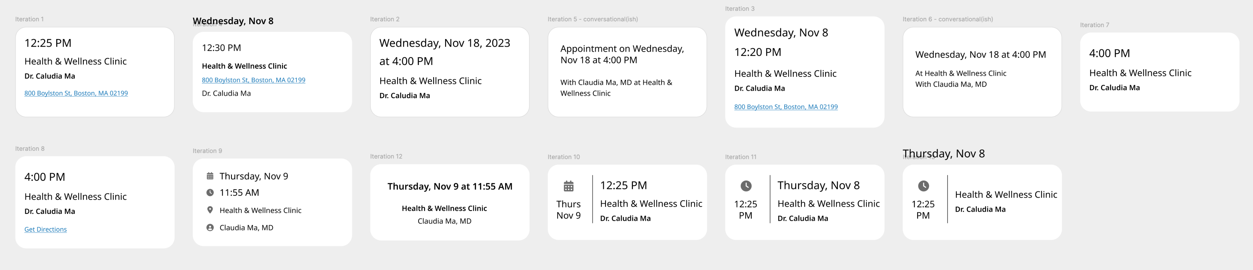
While I waited for the first A/B test's results, I started ideating on how we would visualize the appointment information. Based on our initial survey results, we discovered that users were least satisfied with the appointment card element on the page. We also knew that the appointment information presented on the screen was somewhat repetitive to what the users has already received via text or email. To address these concerns, I began to explore ways to streamline the information, enhance the visual appeal, and ensure that the appointment card provided unique value beyond what users had already seen in their messages.
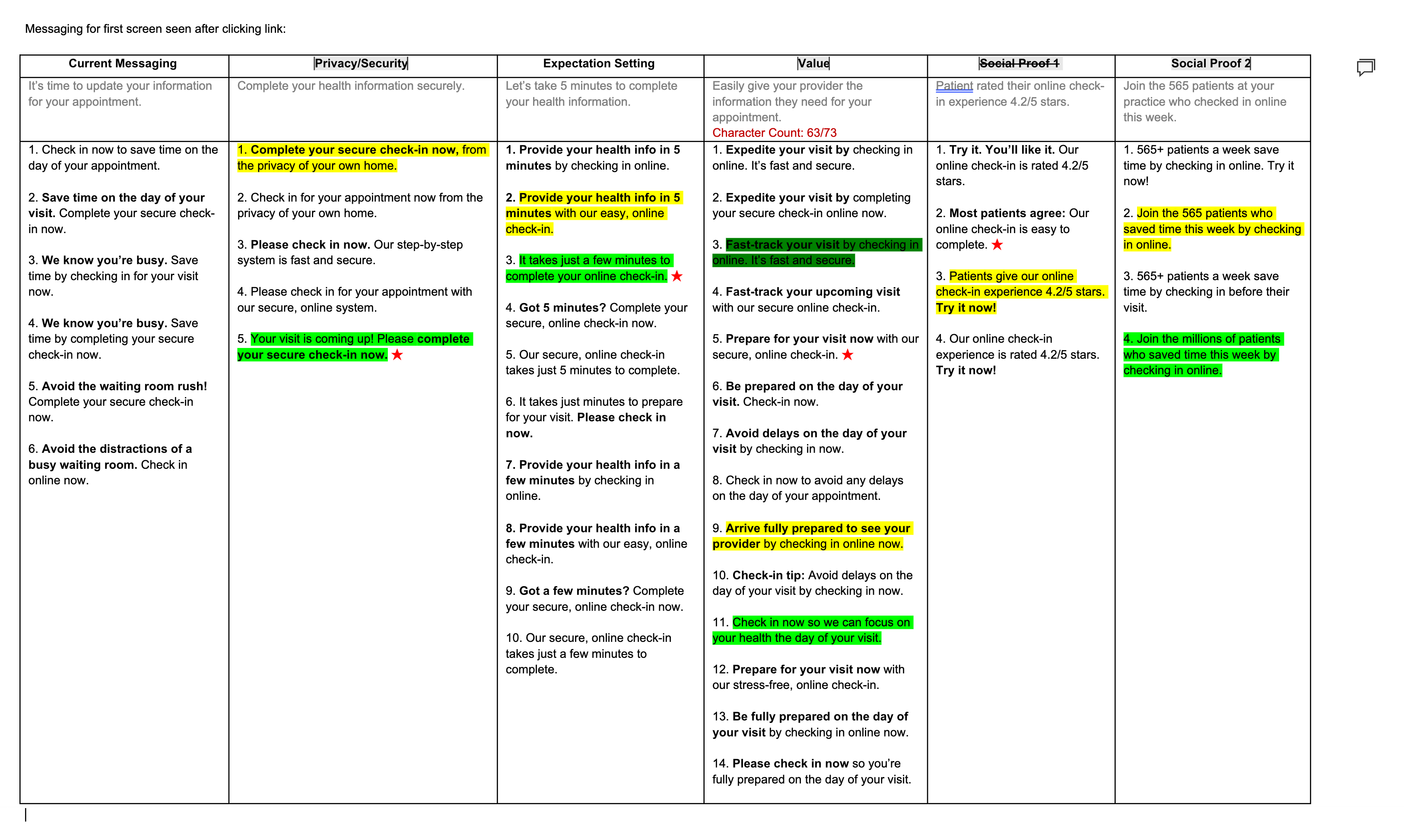
The next phase of the project involved A/B testing different variations of copy, including the page title and the button's call-to-action. In collaboration with an in-house copywriter, we crafted multiple options for each based on several thematic ideas to guide our variations. We then decided on our top three options and ran them through an A/B test to see which performed best.
In our quest to optimize the landing page, I along with a fellow junior designer created over 160 iterations before finding the perfect one to launch in production for testing. This process involved close collaboration with our product manager and architect, ensuring each variation was meticulously evaluated for its potential impact on conversion rates. By continuously refining different elements, we were able to identify the variation that best met our design goals and user needs. The final iteration represented the culmination of extensive experimentation and collaboration, ultimately helping to improve our conversion rates.
.png)
Go back to the Patient Intake case study